WWW.PANTHERNATION.COM
GO PANTHERS!
welcome

Welcome to the best UNI Panther forum on the net!

Become a PN Supporting Member! Get exclusive access to the Panther Den forum and more. Click here for info.

30-minute show exclusively highlighting UNI Athletics. Click here for info.

  • You need to register before you can post: click the register link above to proceed.
  • To start viewing messages, select the forum that you want to visit from the selection below.
  • If this is your first visit, be sure to check out the help page by clicking this link.
  • If you have any questions please use the Contact Us form.
This website is not affiliated with the University of Northern Iowa or the UNI Panther Athletic Program.

Announcement

Collapse
No announcement yet.

Off season chatter: UNI Logo Rebranding

Collapse
X
 
  • Filter
  • Time
  • Show
Clear All
new posts

  • Off season chatter: UNI Logo Rebranding

    Hello,

    Basketball has been over for a few weeks and a lot of fans are getting excited for panther football. Let's get some conversation going!

    Obviously this is all hypothetical and out of pure fun, but I wanted to propose the question: If you could re-brand UNI Athletics with a new logo / type face / design / etc., would you? If so, what would it be?


    I thought of this question while browsing pictures of the UNI logos. I found some random sites with re-branding ideas for UNI.

    http://cargocollective.com/briangund...brand-Proposal

    http://boards.sportslogos.net/topic/...nding-concept/

    A few different takes on the panther. I am not saying that I like EITHER of those ideas. However, if was fun to see a new look on panther athletics. Obviously a more professional job would be done if there ever was a change.

    I think being a FCS football team and mid-major basketball team makes you walk a fine line with logos. Lots of FCS teams have outdated logos or logos that look much more like high school than college level. I really do like our current logo. I think it meshes well with the logos of the MVC and MVFC. I have heard complaints that the panther head looks more like a gopher. I have also heard fans of other teams remark that it is strange that our panther in the logo is gold; however, our mascot (TC) and other panther sketches around campus and on apparel (etc.) are black panthers. I can't say it really bothers me, but just something to think about.


    So what do you think? Would you change it? What would you change? And none of this "Let's win a few NCs first / let's worry about student attendance first / let's worry about funding first / etc/." Just for fun.

  • #2
    Re: Off season chatter: UNI Logo Rebranding

    Gold is a school color, so I have no problem with the panther in the logo being gold.
    But having the actual mascot be a gold panther would look silly.

    I don't have a problem with the current setup.
    though it might look better to make the 4th tooth white like the others (I mean, I understand the reasoning behind it being shadowed, but sometimes it just looks kinda weird)

    Comment


    • #3
      Re: Off season chatter: UNI Logo Rebranding

      I like the UNI/Panther-head as it is. Works for the FB helmets, and I'd put it on the basketball jerseys also. And it's been around just long enough to have some recognition. Much, much better than the superimposed UNI logo that preceded it.

      I do have a soft spot for the NI-inside-a-football that was used when we went to the DII playoffs.

      Comment


      • #4
        Re: Off season chatter: UNI Logo Rebranding

        Fun stuff...but I think I'd stick with the current logo.

        It's stood up pretty well since it's introduction and agree the recognition is solid. Can't change these things too often.

        That said...I do prefer the current logo with the panther in purple as well as the "UNI".

        My request...the old purple helmets with script UNI come out for one game every once in a while. Love that old school look.
        Winning is more fun than losing.

        Comment


        • #5
          Re: Off season chatter: UNI Logo Rebranding

          Keep it as is. Branding used to be a pretty big problem for us - let's not change a thing. We're on a roll - in many ways - change. nothing.
          "...the Northern Iowa men's basketball team reached the ultimate highs before hitting a devastating low. Unexpected success, followed by unimaginable failure. And they owned it -- all of it -- for the world to see. Like men. Like leaders. Like champions -- in a way no tournament bracket could ever define."

          Comment


          • #6
            Re: Off season chatter: UNI Logo Rebranding

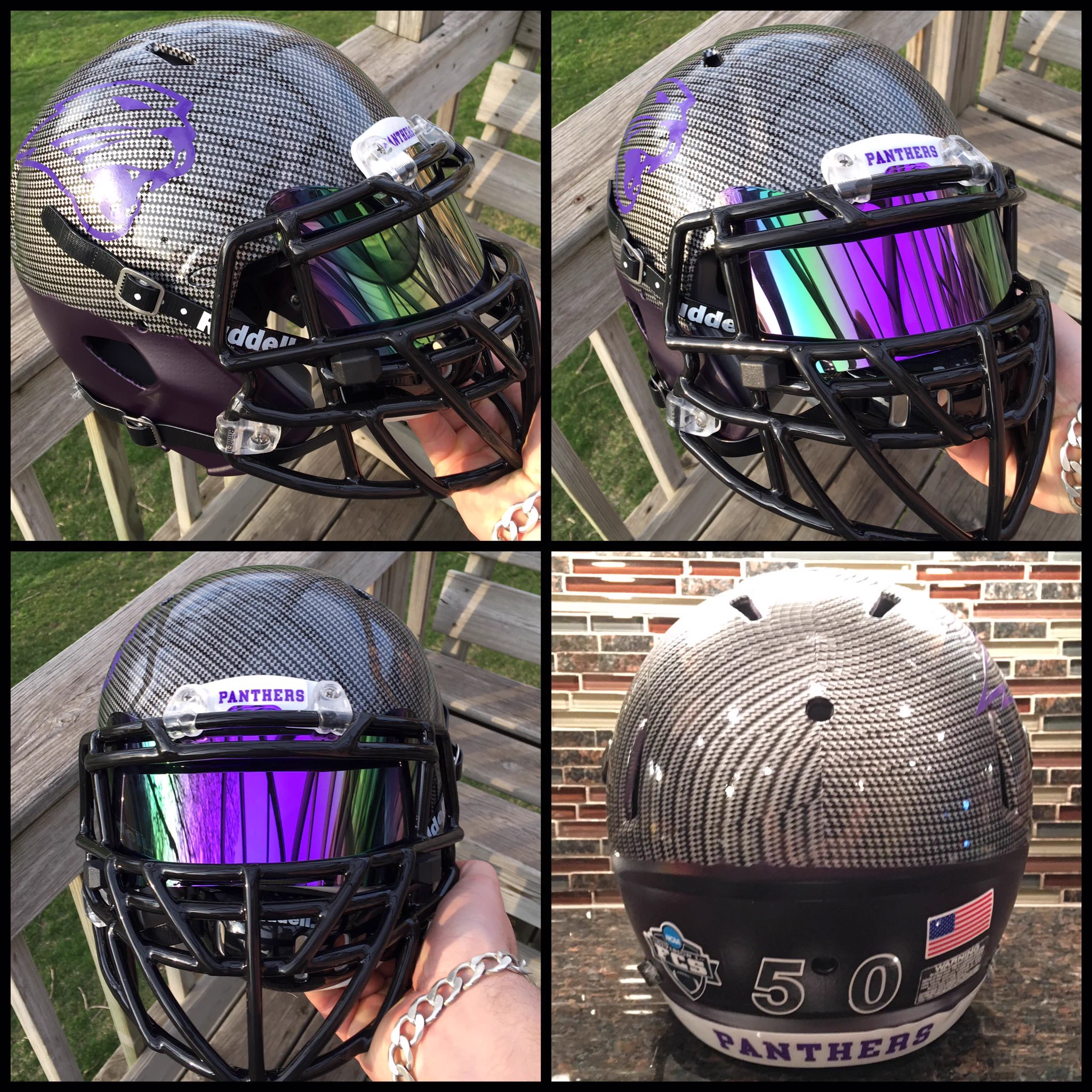
            My concept UNI Panthers carbon fiber concept. C'mon now @CoachMarkFarley & @UNIFootball picture it in the dome #alum


            helmet rebrand by a former football player

            Comment


            • #7
              Re: Off season chatter: UNI Logo Rebranding

              Originally posted by vbfan19 View Post
              Gold is a school color, so I have no problem with the panther in the logo being gold.
              But having the actual mascot be a gold panther would look silly.

              I don't have a problem with the current setup.
              though it might look better to make the 4th tooth white like the others (I mean, I understand the reasoning behind it being shadowed, but sometimes it just looks kinda weird)
              The updated logo has the fourth tooth. Unfortunately lots of places still use the outdated logo.

              Comment


              • #8
                Re: Off season chatter: UNI Logo Rebranding

                We hit the freaking jackpot with our custom Nike font and we've had the logo as is for 15 years now. Now is not the time to screw with anything.

                I would, however, try to find an alternative to our current football helmets. The matte purple is......not good.

                Either need to go to a satin (like the Vikings) or go to gold (like LSU).

                Comment


                • #9
                  Re: Off season chatter: UNI Logo Rebranding

                  Originally posted by BCPanther View Post
                  We hit the freaking jackpot with our custom Nike font and we've had the logo as is for 15 years now. Now is not the time to screw with anything.

                  I would, however, try to find an alternative to our current football helmets. The matte purple is......not good.

                  Either need to go to a satin (like the Vikings) or go to gold (like LSU).
                  Yellow, and let's be real we haven't used gold in about 20 years, would only work if the football team went to yellow pants. Black or purple pants with a purple or white top and yellow helmet would not be good.

                  I don't see Farley ever going yellow pants.

                  The correct answer is, if you want to keep the logo, go back to a true old gold. Old Gold =/= Yellow

                  The left is old gold, the middle is yellow. One of them is a school color - the other isn't but is used for some reason

                  Comment


                  • #10
                    Re: Off season chatter: UNI Logo Rebranding

                    I don't see us going to true 'old gold'. Really hard to not make it look really dingy.

                    I'm totally on board with yellow pants...

                    Comment


                    • #11
                      Re: Off season chatter: UNI Logo Rebranding

                      For some reason I've always like the simple NI logo

                      https://s-media-cache-ak0.pinimg.com...380c7668d0.jpg
                      "I think they're very good," Farley said of the preseason top 25 Hawkeyes. "But so are we."

                      Comment


                      • #12
                        Re: Off season chatter: UNI Logo Rebranding

                        Originally posted by BCPanther View Post
                        I don't see us going to true 'old gold'. Really hard to not make it look really dingy.

                        I'm totally on board with yellow pants...
                        JMU and Washington pull it off pretty well

                        Oddly enough, here is a photo with a yellow helmet as well


                        Washington

                        Though Washington more or less ignores it with basketball unless they are wearing their gold uniforms.

                        Comment


                        • #13
                          Re: Off season chatter: UNI Logo Rebranding

                          The UNIDOME needs new turf... I would go with bright gold UNI , black panther head at mid field, purple end zones with bright gold lettering Northern Iowa (North end zone)/Panthers (south end zone). I understand trays will be used for the new turf. The purple on the helmets/jerseys would be the vikings hue. Gold pants would be okay... Alternate the green field hue is okay as well... Overall, we don't need to change much...

                          Comment


                          • #14
                            Re: Off season chatter: UNI Logo Rebranding

                            The problem with "old gold" is that it doesn't do well with the purple shade that we have (which is the perfect shade BTW). It pretty much looks like brown mustard.

                            That color gold would need to be matched with a much darker color like a black or dark gray.

                            Comment


                            • #15
                              Re: Off season chatter: UNI Logo Rebranding

                              Any new turf put at midfield should have the 40 yard long prowling panther brought back.

                              Comment

                              Working...
                              X